Typography - Task 4: Final Compilation & Reflection
Week 14
MOO RENEE / 0359595 / Bachelor of Interactive Spatial Design
Typography
Task 4 Final Compilation & Reflection
JUMP LINK
- Task 1 / Exercises
- Task 2 / Typographic Exploration & Communication
- Task 3 / Type Design & Communication
- Task 1 Exercise 01 Type Expression


- Task 1 Exercise 02 Text Formatting
- HEAD
- Font/s: Bembo Std (Bold / Bold Italic)
- Type Size/s: 68pt and 24pt
- Leading: 70pt and 26pt
- Paragraph spacing: 0pt
- BODY
- Font/s: Bembo Std - Regular
- Type Size/s: 9pt
- Leading: 11pt
- Paragraph spacing: 11pt
- Characters per-line: 55 - 66 character
- Alignment: left justified
- Margins: Top : 123mm / Right ,Left ,Bottom :26mm
- Columns: 2
- Gutter: 10


- HEADLINE
- Font/s: Futura Std (Extra Bold, Medium, Bold)
- Type Size/s: 397pt ,186pt and 80pt
- Leading: -
- Paragraph spacing: -
- BODY
- Font/s: Bembo Std - Regular
- Type Size/s: 22pt
- Leading: 24pt
- Paragraph spacing: 15pt
- Alignment: left justified
- Margins: Right ,Left ,Top :90px / Bottom :500px
- Columns: 2
- Gutter: 75px
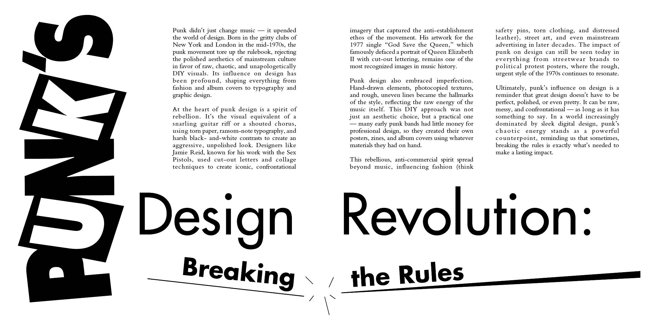
Figure 2.2 PDF without grid and baseline

Figure 2.3 JPEG with grid and baseline
- x-height : 500pt
- ascender : 878pt
- descender : -279pt


Over these 14 weeks of typography class, I have explored and learned a lot about typefaces and their history — things I never thought to look into before. I now understand concepts like kerning and other details, which I found fun to learn. Designing my own font was also an interesting and enjoyable experience.
For the first assignment, expressing the meaning of a word through its visual appearance was something new to me. The second assignment on layout design was a bit of a struggle at first because I didn’t really know where to start or what I could do. However, as I continued working on it, things started to improve, and I ended up enjoying the process more than I expected.
For the final task, I personally feel it was the most enjoyable part of this module. It was satisfying to see everything come together in the end. Throughout this module, I also had the opportunity to try new software such as InDesign and FontLab.
Overall, during these 14 weeks, I have learned a lot about typography — especially how even small details can have a big impact on the final outcome, and how much thought needs to go into every design decision.


Comments
Post a Comment