Typography - Task 2: Typographic Exploration and Communication
Week 6 – Week 8
MOO RENEE / 0359595 / Bachelor of Interactive Spatial Design
Typography
Task 2: Typographic Exploration and Communication
JUMP LINK
1. LECTURE NOTE
All lecture note are in Typography - Task 1: Exercises (CLICK ON THIS LINK TO VIEW ALL LECTURE NOTE )
2. ASSIGNMENT INSTRUCTION
Figure 2.1 MIB - MODULE INFORMATION BOOKLET
From the three texts provided, select one and create a layout based on its content using Adobe InDesign.
Images are not allowed (unless otherwise specified). However, minor graphical elements such as lines, shading, and basic shapes may be permitted.
3. WORK PROCESS
3.1 Research
After reading the provided texts, I selected the first and second texts to explore its layout for this assignment. Below is some visual research for both:


Bauhaus: The Movement That Changed Design
- Founded in 1919 by Walter Gropius, the Bauhaus aimed to unify art, craft, and technology.
- Key principle: form follows function – design should reflect practical use.
- Blended architecture, sculpture, painting, and industrial design.
- Legacy: simplicity, functionality, and clarity still guide contemporary design.
Punk’s Design Revolution: Breaking the Rules
- Emerged in the 1970s New York and London music scenes.
- Punk design rejected mainstream polish for raw, chaotic, DIY visuals.
- Emphasized imperfection and hand-made elements (zines, posters, etc.).
- Punk’s rebellious energy spread to fashion, street art, and even advertising.
- Legacy: shows that impactful design can be messy, rough, and rule-breaking.
3.2 Ideation / Exploration
.png)
Sketches Description 1-3
For the Bauhaus movement, which revolutionized design, I focused on architecture, sculpture, painting, and industrial design. These disciplines are characterized by straight lines and a clean, neat aesthetic. I wanted to explore this idea through lines of different widths and gradients instead of showing the actual buildings themselves, to show how lines are fundamental building blocks and an important element in Bauhaus design.
Sketches Description 4-6
For the Punk passage, the three designs share the same title, but the subheading "Design Revolution: Break the Rules" varies in each one. The word "Punk" is inspired by collage techniques, where people cut and paste paper together. I used positive and negative space to create a similar effect. For the phrase "Break the Rules," in sketches 1 and 2, I added some lines that split the text in half to visually represent the idea of breaking apart and disrupting the conventional.
3.3 Develop Process
After deciding on the title that I am going to use for this assignment, I started to explore different layout options in InDesign.

The first sketch in InDesign features the text, but it has different margins compared to the other sketches. In Sketches 2 and 4, there is empty space above or below the text, making the layout look disorganized and unbalanced.
In Sketch 3, the text direction curves to the right, making it difficult to read and therefore unsuitable. Additionally, in Sketch 4, the complex text layout further complicates readability.
Also, for the phrase “Design Revolution,” I need to make it straight. Additionally, the lecturer suggested that I could play around with the title and not just leave it in its current position, so I started to experiment with different layouts for it.
.png)

.png)

Layout Description :
For this Final layout, I have used the punk design revolution: Breaking the Rules passage. The punk title features black squares with white words, creating an effect that suggests cutting and pasting, evoking a sense of collage. This approach was inspired by the research I did in the top section. The "Design Revolution" text is presented in a straightforward and consistent manner to ensure clarity and readability. However, for "Breaking the Rules" at the bottom, the lines are intentionally broken in half to visually convey the concept of breaking and expanding beyond the artboard.
4.FINAL LAYOUT
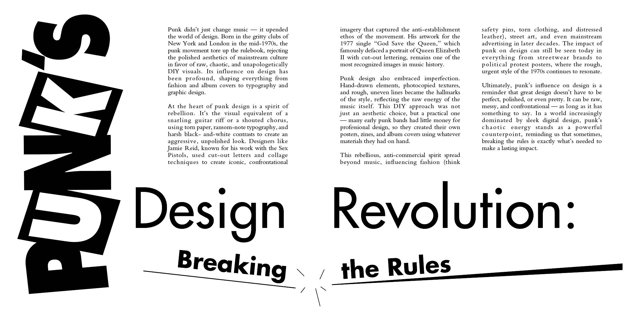
Figure 4.2 PDF without grid and baseline

Figure 4.3 JPEG with grid and baseline
5. FEEDBACK
Week 6 - In this week’s class, we focused on Task 2 — creating layouts for the selected text. I created six text layouts: three for PUNK and three for BAUHAUS.
Specific Feedback:
- There are too many shapes and lines in the frame, making it hard to read.
- The 4th can be explored further. Use it for the final version for now, include the actual content, and present it next week.
Specific Feedback:
- For the second, third, and last sections, there is a sudden empty space, and the text is not well organized. In the third and last sections, this is not acceptable.
- For the phrase “design revolution”, make it straight, but you can maintain the idea of breaking the rules.
- Part 2: - The third and fourth versions could be used as the final design, but the spacing needs to be more careful, and the margins should be adjusted. Also, the third version has some empty spaces—please adjust the margins.
6. REFLECTION
6.1 Experience
In this task, the experience was very interesting. Unlike the first assignment, we used InDesign more extensively and also incorporated Adobe Illustrator to create the text for the title. It was quite fun to play around with the text by reading the given passage and visualizing it. However, there was a frustrating part: in my InDesign, the grid wasn’t showing up, and I later found out it was an issue with the image i export in Adobe Illustrator. Also adjusting the text was tricky because it either went too close together or too far apart, which was frustrating at times too, but I was able to overcome it in the end. Overall, the experience was quite fun and valuable.
6.2 Observation
For this task, I observed that fitting everything into a spread while incorporating graphical elements was quite challenging. If there’s too little, the layout looks empty if there’s too much, the focus shifts from the text to the graphics. Adjusting the tracking of the text to fit in the text box was also difficult because the words could get cut in half and continue on the next line. While adjusting, the spacing between the letters would either become too close or too far apart, which was challenging to manage. It was also interesting to see how different the text looked with more or less kerning.
6.3 Findings
Creating a layout is quite a challenging process. It’s not just a quick task—it requires research, exploration, and understanding. It’s also time-consuming. I learned how the layout, margins, and overall consistency can affect the final appearance.
7. FUTURE READING

Computer Typography Basics by David Creamer
By reading this book Computer Typography Basics by David Creamer helped have help me understand the essential concepts of digital typography. The book explained how to choose fonts that are visually appealing and how to arrange them to create balance in a layout. It have also covered the importance of tracking, kerning, and leading, and how these small adjustments can dramatically improve readability and visual impact.
The book discussed about the role of margins and grids in creating consistent, professional-looking designs. Also highlighted the balance between text and graphic elements to avoid clutter or empty spaces. Overall, this book have gave a solid foundation in digital typography and made me understand more in using these techniques in my design projects.


Comments
Post a Comment