Illustration & Visual Narrative / Task 2: Composition Continuous 20%
Task:
- This project involves designing a visually engaging world or environment that embodies the mood, story, and personality of a chosen character. Drawing from the principles outlined in Framed Ink: Drawing and Composition for Visual Storytellers, the task emphasizes the application of key composition techniques such as balance, contrast, focus, and flow to construct a compelling visual narrative. The environment may be inspired by the first assignment character or take on an entirely new direction that supports a different narrative. The goal is to effectively arrange elements within the scene to guide the viewer’s eye, establish depth, and enhance storytelling through strong visual design.
- CLICK HERE - Composition Research
- CLICK HERE - Ideation
- CLICK HERE - Digitalize Development
- CLICK HERE - Final Outcome
- CLICK HERE - Reflection
1. COMPOSITION RESEARCH
To begin the assignment, I started by conducting research on the Principles of Composition. This helped me better understand how to structure visual elements within a scene to create balance, focus, and harmony.
Frame Ink PDF- CLICK HERE
Below are some basic composition techniques I researched on:


Below are some notes I took taken for the research:
1.1 Rule of Thirds
- Ways: Dividing the frame into a 3x3 grid and placing key elements along the lines or at intersections.
- Purpose: Creates visual balance and makes the composition more dynamic than center placement.
- Related Principles: Balance, Focus, Proportion.

1.2 Leading Lines
- Ways: Creating lines (real or implied) in a scene that guide the viewer’s gaze toward the subject.
- Purpose: Creates rhythm, directs attention, and adds depth or movement.
- Types: Horizontal, Vertical, Diagonal, Curved (S-Curve), Converging (Vanishing Point), Implied.
- Related Principles: Movement, Focus, Depth.
1.3 Framing
- Ways: Using elements in the scene to frame/surround the main subject (Example Using: windows, trees, arches).
- Purpose: Draws attention to the subject and adds layers or context.
- Related Principles: Focus, Depth, Unity.
1.4 Symmetry
- Ways: Placing elements evenly on either side of a empty Frame.
- Purpose: Creates a sense of formality, harmony, and stability.
- Types: Horizontal, Vertical, Radial.
- Related Principles: Balance, Harmony.
1.5 Radial Balance
- Ways: Elements radiate outward from a center point(example: ripples in water)
- Purpose: Directs attention toward the center, often creating harmony and focus.
- Related Principles: Balance, Focus, Unity.
1.6 Center Focus
- Ways: Placing the subject directly in the center of the frame.
- Purpose: Draw attention to the subject with strength and simplicity.
- Used When: The subject is strong, symmetrical, or meant to be the most important item in the scene.
- Related Principles: Emphasis, Focus, Balance.
1.7 Depth and Layering
- Ways: Using foreground, middle ground, and background elements to create sense of space.
- Purpose: Makes a 2D image feel 3D creating a sense of space in 2D.
- Techniques: Overlapping, scale, leading lines, atmospheric perspective.
- Related Principles: Depth, Proportion, Movement.
Further exploration of composition using the inspiration I researched

.png)
With these principles research it have guided me a lot in thinking about how to place characters, props, and backgrounds effectively in the environment design.
After completing the composition research, I reviewed the characters I created in the first assignment :


2. IDEATION
Analyzing background ideas for each character and creating a story behind them to expand world-building. This includes character descriptions and setting ideas :
2.1 Visual reference / inspiration research

Background 01 - Citizen
For this background, it is the one that changed the most. Initially, I had imagined it in an outdoor setting. However, after referring to the Frame Ink book, to fit in the composition provided I decided to give it the feeling of being half-indoor. I wanted to create the impression of someone flying up from a well or enclosed space. Instead of walking up, this character—who has wings—flies up, like a city dweller leaving a library by soaring instead of walking. I also added some dust and a sense of wind below to create the feeling of them lifting off from the bottom, viewed from a low angle looking up.
Below is the sketch process, showing the shift from outdoor to indoor.

Background 02 – Adventurer
The second background is set in a forest environment. By drawing the trees in different layers and arranging them to surround the scene, I aim to lead the viewer’s eye into the image. At the center, a starlit sky guides the viewer’s gaze toward a giant crystal, which the adventurer stands on, hinting at a place no one has ever explored before. The overall atmosphere is natural and mysterious, evoking a quiet sense of peace. For this character, the first idea that came to mind was an outdoor setting—specifically a forest or jungle. This setting reflects her adventurous personality, as she spends much of her time outside the city, searching for new resources. The natural environment highlights her freedom, independence, and connection to nature, conveying a mysterious and wild feeling that aligns with her lifestyle of constant exploration, discovery, and living beyond the city’s boundaries.

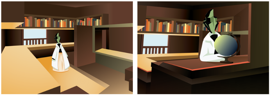
Background 03 – Bookseller
For this third background is set in an indoor bookshop in the city, creating a warm and comfortable atmosphere. By using the space on the artboard and adding a subtle curve to guide the viewer’s eye in an L-shape, I aimed to show a sense of reading and the presence of booksellers waiting for customers.
The overall setting i wanted to create is a feeling of a cozy, inviting space filled with books, hinting at quiet stories waiting to be discovered. For this character, the idea is to create a bookshop that reflects her deep appreciation for literature and the peaceful life of a bookseller. The environment will highlight her connection to knowledge and her role as a guide for others seeking wisdom.


Once the outlines were complete, I used the Live Paint Bucket Tool to fill in the desired areas, starting with gradients. I experimented with different color options throughout this process to ensure they matched the intended mood. While adding gradients, I also considered the light sources and how they would affect the overall image. Although I made some adjustments along the way, I saved the final refinements for later to ensure everything looked cohesive. For the first and third backgrounds, I only applied base colors with minimal gradients at this stage, leaving the more detailed gradient work for the final refinement.
Note: I forgot to take a picture of Background 3 at this stage.


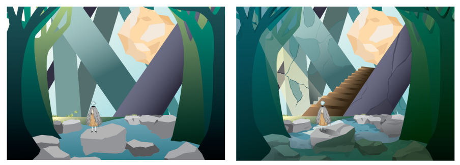
Figure 3.3.2 Before and After Adding Light and Shadow (Example 2)

With all the background done, I started refining the image by adding more details, as well as more light and shadow, to make the colors darker and create contrast. I also made some composition changes at this stage, as some elements didn’t fit with with the frame ink composition. I adjusted the angle and added some new elements to make the composition better.

Other than adjusting this, I have also made some changes and adjustments to other aspects, such as the perspective for the first background character. Initially, it looked too flat, so I needed to make it more solid.


This assignment has helped me gain a better understanding of composition and its importance in illustration. Composition can guide the viewer’s eye and tell a story in a smoother way purely through visuals. When elements are placed in different scales or within a frame, even if they are the same elements, they can create a completely different story depending on how they’re arranged.
During the process of creating the backgrounds for the first and the last pieces, I was a bit stuck at times, trying to figure out how to apply the frame ink composition. However, after several tests and adjustments, I was able to overcome these challenges and finish the work.
I also realized that drawing a background is much harder than drawing a character in terms of idea development, composition, layout, and working in Adobe software. With so many elements involved, it sometimes overwhelmed me, and I would feel lost about where things should go. Adding gradients was also a bit frustrating, especially when I couldn’t apply them individually, but I eventually found alternative ways to fix these issues.
Overall, this assignment has taught me the importance of composition, how to use it effectively, and what it can do for an illustration. I also learned how to use gradients to create light and shadow, as well as how to use Adobe software more confidently.


Comments
Post a Comment