Interactive Design / Weekly Note and Progress
Week 01
Week 02
- Keep the design simple and easy to use, avoiding anything too fancy or cluttered.
- Aim for organization and clarity.
- Ensure that not everything is the same size. Vary the sizes and colors for emphasis.
- Avoid using too many different colors.
- Always ask for confirmation to prevent sudden mistakes
- Example: "Are you sure you want to permanently delete this folder?"
- Example (for a bank transfer): "Are you sure you want to transfer this amount?"
Class Activity in a Group -Taylor’s way finding kiosk

Some short description on the class activity -
- This interface we created is designed to help people who have difficulty finding parking and locating places when they first arrive at Taylor's. To solve this problem, our group included features like a parking search function that allows users to see if there are available parking spots and pay for them. We also added a GPS function to guide them to their desired locations, including restaurants on campus. And also, we have incorporated a "spin the wheel" feature to help users decide where to eat if they're unsure.
Week 03
Why Website Structure Matters:
- A well-structured website allows users to easily understand its purpose and navigate effectively.
- Users should be able to identify what they can do on the website right away.
Basic Structure of a Website:
- Header:
- This typically includes the logo or brand name of the website, which is usually positioned on the left.
- Sometimes, it may be centered, but this is rare since users generally scan websites from top to bottom and left to right.
- The logo often links back to the homepage.
- Body:
- This section contains the main content of the website, which varies depending on its purpose.
- Footer:
- The footer often includes copyright information and links to social media.
- Footers used to be short, they have become longer recently.
- For example, footer on Taylor’s website contains extended information.
Tutorial and practical Start / do exercise 02 in class (web replication)
- Step 1: Open the website and ensure it is fully loaded.
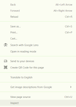
- Step 2: Right-click and select "Inspect."
- Step 3: At the top, click the three dots and select "Run command."
- Step 4: Search for "Screen" and select "Capture full size screenshot."


Week 04
- No class this week Just submit our work
Week 05
***Submit project 01 next week ***
This week’s lecture will revisit last week’s slides (The Web - Refer to Week 04).
Some Note :
Why websites are developed
- Websites are created to share documents and information with others.
How a website works
- Websites function through a domain name system. The domain name points to a server where the website is hosted.
Domain Names
- Domain names are crucial for websites. For example:
- .com is for general use and can be purchased by anyone.
- .my is typically used for companies based in Malaysia.
- Domain names are crucial for websites. For example:
Page structure
- Web page structures are similar to newspapers but adapted for the web. Elements like size, bold text, location, and typeface can create different layouts and hierarchies.
- Instead of manually changing each element, we can use the style function (such as formatting in Word documents) to adjust the appearance.
HTML Notes
- HTML uses open tags and closing tags:
- Example:
- Opening tag:
<p> - Closing tag:
</p>
- Opening tag:
- If you don’t close a tag, the text will continue to follow the same formatting.
- Example:
- HTML uses open tags and closing tags:
HTML Headings
- HTML has six heading levels, from h1 (the largest) to h6 (the smallest).
Bold text
- Use the
<b>tag to bold text in HTML.
- Use the
Lists
- HTML supports both ordered lists and unordered lists.
In class, we practiced HTML using Notepad :


Week 06
Adobe Dreamweaver Basics (note)
Inserting an Image
- Go to Insert > Image.
- Select the desired image and press OK to add it to the page.
<th>or<tb>: Defines a column.<tr>: Defines a row.- Row Span: Use to merge two rows into a single cell.
- Use the Properties Bar to edit and adjust properties (e.g., image dimensions, table cell width, etc.).
- Use Style Elements to modify text properties, such as font and color.
- Go to Google Fonts.
- Select the desired font and press Get Font.
- Click the Paper Bag icon to access the embed code.
- Copy the embed code and paste it into your HTML file to apply the font.
- Go to Netlify and choose Manual Deployment.
- Drag and drop your project folder to deploy.
- Check the generated link to view your site.
- do the small side bar and show next class
- Exercise 03
Week 07
- CSS Selectors
- Add a new site on Netlify.
- Deploy manually by selecting your files to upload.
- Preview the site to ensure everything is working as expected.
- Go to Site Configuration and change the site name if needed.
- Copy the site link and submit it on Blogspot
Week 09
Note
Assignment 02 Details
Objective: Design and prototype three pages of a website using Figma. The website should have clear navigation and a professional, clean layout.
Pages to Create:
Home Page:
- Ensure clear navigation.
- Include a strong call-to-action (CTA).
Core Content Page:
- Choose one core page to prototype, such as:
- About Us
- Products or Services
- Focus on structuring content effectively.
- Choose one core page to prototype, such as:
Contact Page:
- Design an interactive prototype to show how users can interact with the form or contact details.
Requirements:
- Maintain a consistent website structure across all pages.
- Prioritize cleanliness and simplicity in design (no need for overly fancy visuals).
- Ensure usability and intuitive navigation.
Figma Introduction Overview
Figma Basics:
- Understand the interface (Toolbar, Layers, Properties Panel).
- Tools: Frame, Text, Shape, and Pen.
- Creating and organizing components.
Prototyping:
- Linking pages for navigation.
- Adding interactions (hover effects, buttons, etc.).
Tips for Clean Design:
- Use grids and alignment tools.
- Stick to a consistent color palette and typography.
Lecture: Box Model
What is the Box Model?
The CSS box model is a framework used for layout and design. It includes:
- Content: The actual content of the box (text, images, etc.).
- Padding: The space between the content and the border.
- Border: The edge around the padding.
- Margin: The space outside the border that separates the box from other elements.
How to Apply:
- Use the box model to control spacing, sizing, and alignment in your web layouts.
- Visualize how padding, border, and margin affect the total size of an element.

- Position
- By default, any element's position is static. This means it simply appears in the normal document flow.
- No need to declare position: static; unless you're overriding a different positioning rule.
- Relative:
- The element remains in the normal document flow but can be shifted relative to its original position using top, right, bottom, or left.
- The space it originally occupied is still preserved in the layout.
- Absolute:
- The element is removed from the normal document flow.
- Positioned relative to the nearest positioned ancestor (an ancestor with position: relative, absolute, or fixed).
- Has height but does not define its width automatically.
- Fixed:
- The element is removed from the document flow and is positioned relative to the browser window.
- The position remains fixed even when the page is scrolled.
- pos (short for "position"): Used to define the positioning of an element.
- Use position: static; only when reverting from other positioning styles.
- Use position: relative; when an element needs to maintain its position within the flow but still be shifted slightly.
- Use position: absolute; or fixed; for precise placement outside the normal flow.


Comments
Post a Comment